From Framework to Design System
36.1% reduction in design task completion time, achieved by building Matillion's ETL design system from scratch: components, patterns, and documentation, while embedding UX practice into how the engineering team worked.
The Problem
⚠️ Matillion's ETL product had been built without a design system.
Engineering had moved fast using Sencha GXT, a rigid Java/ExtJS component framework, to build out the product. It worked technically. But the design side was a different story. Designers were working in isolation, rebuilding UI from scratch with every new feature. There were no shared components, no agreed patterns, no single source of truth.
The result was a product that looked and felt inconsistent. And a design team spending significant time on assembly work, building what should already exist, rather than solving real user problems.
But the deeper issue wasn't just tooling. The engineering team had limited exposure to UX thinking. Design and engineering weren't collaborating. They were operating in parallel, occasionally intersecting at handoff. There was no shared language, no shared process, and no shared understanding of what good looked like.
My Role
I owned this entirely, end-to-end:
- Audited the existing product to understand the current state of components, patterns, and inconsistencies
- Built the ETL design system in Figma: components, variants, Auto Layout, edge cases, and documentation
- Tested the system with the design team using structured task-based tests (old workflow vs new)
- Educated the engineering team on UX practice and how to work with the design system
- Worked with engineers to implement components within the constraints of Sencha GXT
- Introduced new components and patterns where GXT's rigidity required custom solutions
- Maintained the system as a live, evolving resource, not a one-off deliverable
Results
✅ 36.1% faster design task completion, measured through structured before/after testing
✅ Full design system shipped - components, patterns, and documentation, all live and in use
✅ Engineering team upskilled - practical UX knowledge embedded in how the team works
✅ Product consistency improved - shared components and patterns replaced designer-by-designer decisions
✅ Design reviews more focused - less time correcting inconsistencies, more time improving the experience
✅ Business value protected - delivered alongside prioritised product work, not instead of it
What I Set Out to Solve
Three problems, not one:
- "Designers are rebuilding the same components from scratch, every time." No shared library meant every new screen started from zero. Inconsistency crept in at every edge.
- "The product looks like it was built by different people, because it was." Without a system, visual and interaction patterns diverged across the product over time.
- "Engineers are building without UX context." The team was shipping functional software, but UX culture, thinking about how people actually use things, wasn't embedded in how they worked.
Solving any one of these in isolation wouldn't be enough. The design system had to address all three at once.
Understanding the Landscape First
Before building anything, I needed to understand what existed and why it had evolved that way. What I found:
- Sencha GXT provided a baseline set of UI components, but they weren't designed with UX consistency in mind. They were functional building blocks, not a design language.
- Figma files were designer-by-designer, feature-by-feature. No shared styles, no shared components, no naming conventions.
- Engineers were making visual and interaction decisions themselves when design guidance wasn't available, not out of carelessness, but because there was no system to reference.
- Design reviews were slow and feedback-heavy because so much needed correcting at the pattern level, not just the pixel level.
Matillion's ETL product, built on Sencha GXT - functional, but designed feature-by-feature with no shared system behind it.
This wasn't a failure of people. It was a structural gap. The product had outgrown the way it was being designed and built.
Design Goals
- One source of truth - a Figma library that designers pull from, not build from scratch
- Components that reflect reality - aligned to what engineers can actually build in Sencha GXT, with custom patterns introduced where GXT falls short
- Every state designed - not just the happy path. Empty states, error states, loading states, edge cases with long content or missing data.
- Engineers enabled, not just handed off to - the system needed to change how the engineering team worked, not just give designers faster tools
- Business value protected - this ran alongside prioritised product work, not instead of it
Building the System
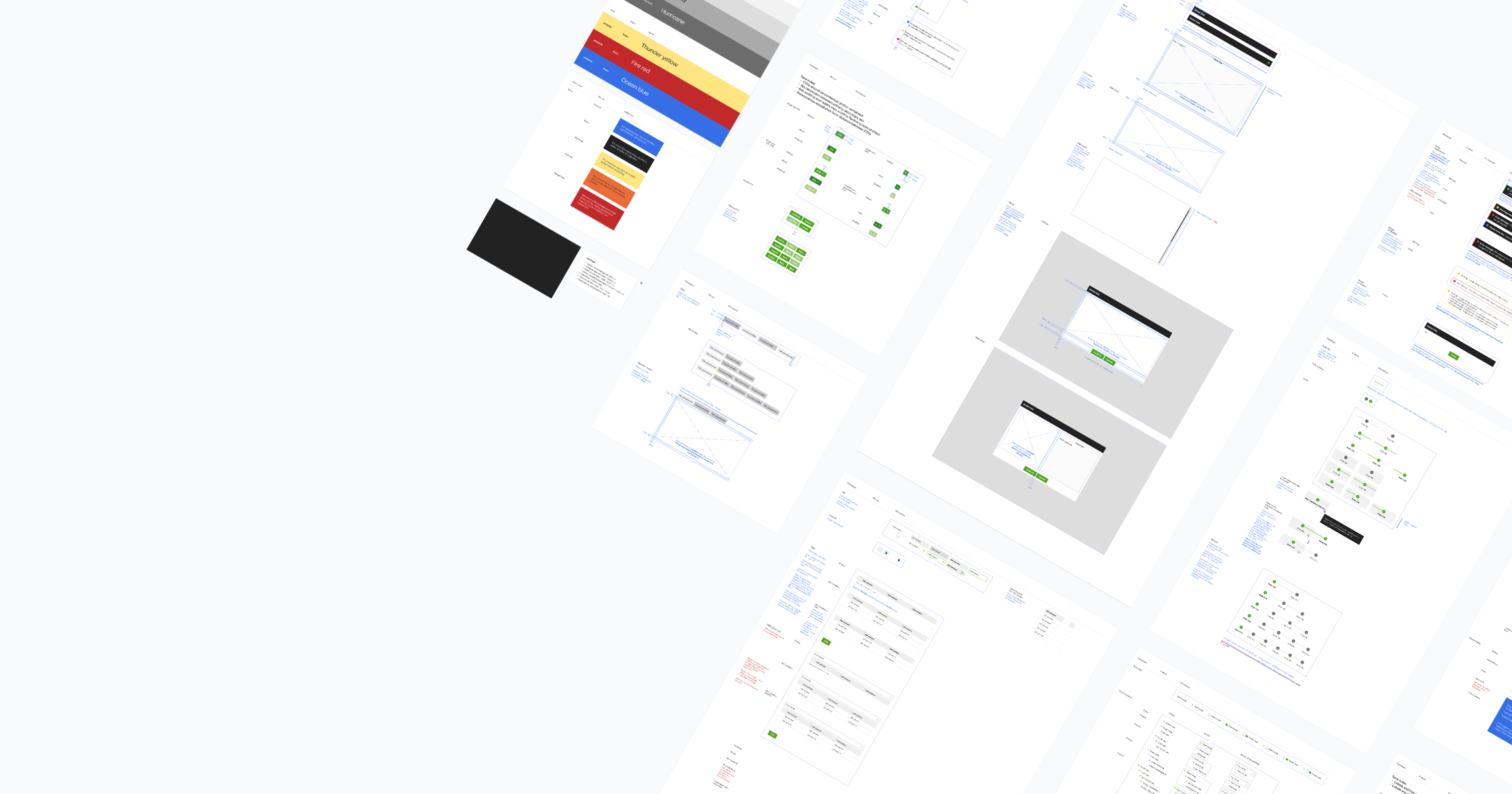
Component Architecture in Figma
Every component was built with Figma's Auto Layout and Variants from the ground up:
- Auto Layout ensured components stretched, stacked, and responded correctly across different content lengths and screen sizes, with no manual resizing needed.
- Variants covered every meaningful state: default, hover, focus, active, disabled, error, loading, and empty. Designers never had to improvise a state that wasn't already designed.
- Component Properties allowed text, icons, and visibility to be toggled within a single component, reducing the number of variants needed while keeping the library clean.
- Nested components meant global changes propagated automatically. Update the button atom, and every component using it updates instantly.
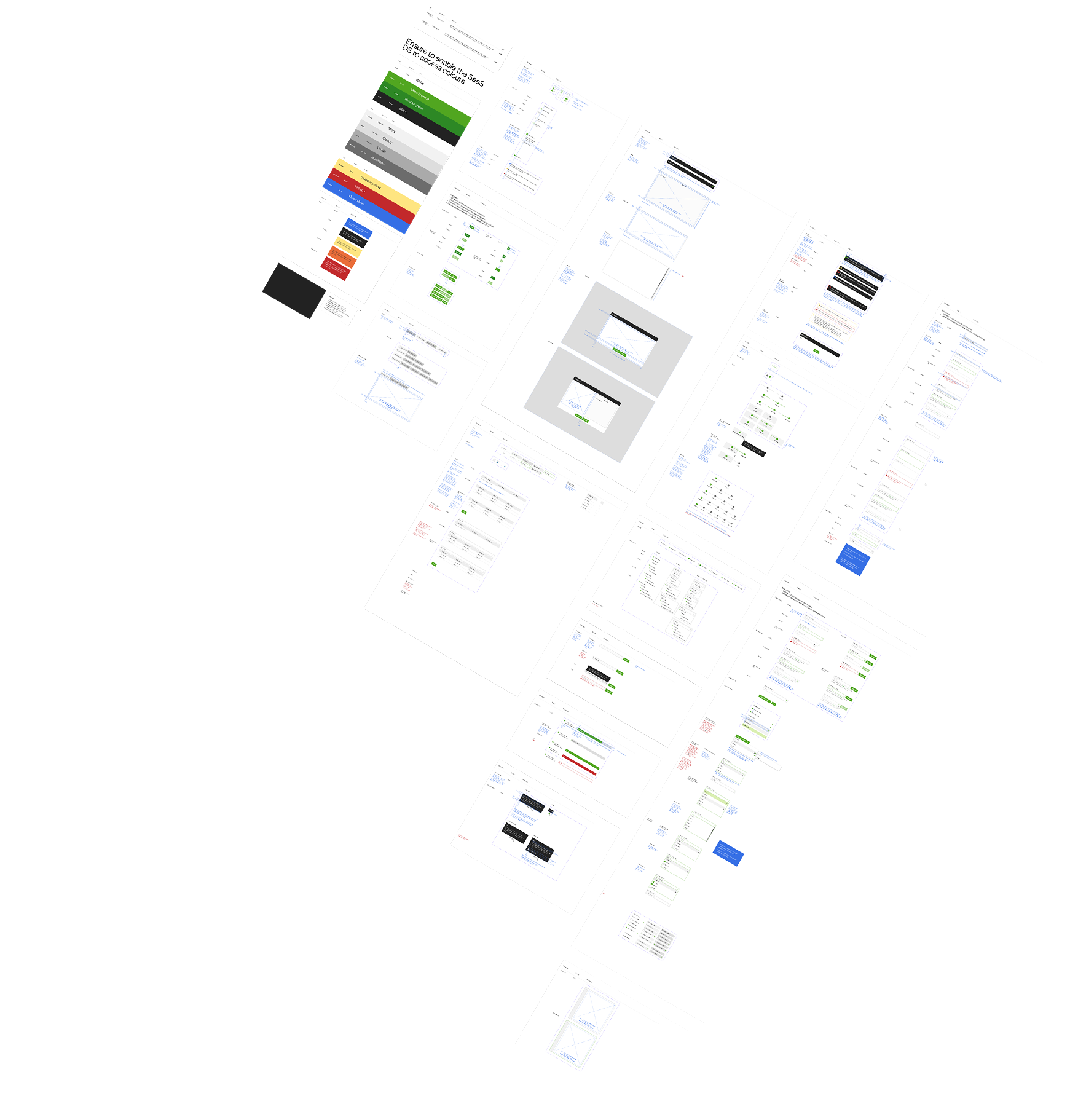
The ETL design system in Figma - components, variants, and documentation built with Auto Layout from the ground up.
Patterns, Not Just Components
Individual components weren't enough. I built out the interaction patterns that connect them:
- Form patterns - label placement, validation timing, error message structure, helper text rules
- Data display patterns - tables, empty states, loading skeletons, pagination
- Feedback patterns - toast notifications, inline errors, confirmation dialogs
- Navigation patterns - consistent with GXT's structural constraints but designed to feel intentional
Each pattern included annotated documentation covering when to use it, when not to, and what edge cases to account for.
Working Within Sencha GXT's Constraints
GXT is rigid. It has its own component model and styling system that doesn't map to a modern design system without significant work. This required a practical approach:
- Where GXT components could be styled to match the design system, I documented exactly how.
- Where GXT fell short, I worked with engineers to introduce new, custom components: built and owned by the team, not inherited from the framework.
- Every new component had a clear Figma counterpart, so design and code stayed aligned.
The goal was never to replace GXT wholesale. It was to extend it thoughtfully, and make the seams invisible to the end user.
Testing the System
The primary users of the design system were the product designers on the team. So I tested it with them.
Method: Structured task-based testing, old workflow vs new workflow, timed.
Old workflow: Designers building UI from scratch. No shared components, no library to pull from. Every screen started with blank artboards and manually constructed elements.
New workflow: Designers working from the ETL design system. Components slotted in, variants switched, patterns applied. Everything snapping into place.
✅ Result: 36.1% reduction in time to complete design tasks
That number came from real timed tasks with real designers on the actual team. Not estimated. Not projected. The speed increase came from eliminating the assembly work that had been eating into design time, freeing up the team to focus on the harder, more valuable problems.
Design reviews also improved. With a shared system, feedback shifted from "this doesn't match that" to "does this solve the user's problem?" That's a fundamentally more useful conversation.
Engineering Enablement
Building the system was only half the job. Getting engineers to use it was the other half.
The engineering team at Matillion was skilled and experienced, but UX culture wasn't embedded in how they worked. They were building features, not experiences. That gap needed to close.
What I did:
- Ran structured sessions with the engineering team on UX fundamentals: not theory, but practical. How to think about user flows, what makes an interaction feel right, how to spot a UX problem before it ships.
- Walked engineers through the design system: how to read it, how to use it, what each component and pattern was for.
- Established a working rhythm where design system components were the starting point for new engineering work, not an afterthought.
- Made changes available progressively, prioritised alongside real product work so the team was never pulled away from business goals entirely.
The shift wasn't instant. But over time, engineers started raising UX questions earlier, in planning, not just in review. That's the real marker of culture change.
Why This Matters
A design system is the most direct intersection of design and engineering work that exists. It requires:
- Enough design depth to build components that are flexible, consistent, and cover every real-world state
- Enough engineering understanding to know what's actually buildable, and how
- The ability to communicate across both disciplines and change how each one works
This project wasn't just about making Figma files faster to build. It was about closing the structural gap between how design thought about the product and how engineering built it.
Reflection
The 36.1% speed improvement is the number that gets attention. But what mattered more was what it unlocked. Designers stopped spending time on assembly and started spending it on thinking. Engineers started asking UX questions earlier. The product started feeling like it was built by one team with a shared vision, because eventually, it was.
A design system only works if the people around it trust it and use it. Building the system was one challenge. Building the culture around it was the harder, more important one.
Next Steps
- Extend the system to cover more complex data visualisation and pipeline-specific patterns
- Build a design QA process: checking shipped UI against design system components automatically
- Explore a tokenised approach to styling that maps directly between Figma and code, reducing drift between design and implementation